
Your wildly multifarious home!
Feed aggregator
Little Princess Baby Blanket Tutorial
This Little Princess Baby Blanket Tutorial walks you through every step of creating this beautiful afghan! It's been nearly 10 years since I designed this pattern, but I still get requests for a tutorial - it's a truly timeless piece, fit for any little prince or princess. Crochet along with the right and left-handed video […]
The post Little Princess Baby Blanket Tutorial appeared first on moogly. Please visit www.mooglyblog.com for this post.
1
Categories: Crochet Life
JUST IMAGINE! October 1938: Avengers of Many Colors
The Green Hornet was clearly popular in 1938 — so much so that DC Comics offered two comic book pastiches of the radio superhero. An urbanized, updated version of the…
The post JUST IMAGINE! October 1938: Avengers of Many Colors appeared first on First Comics News.
Categories: Comic Book Blogs
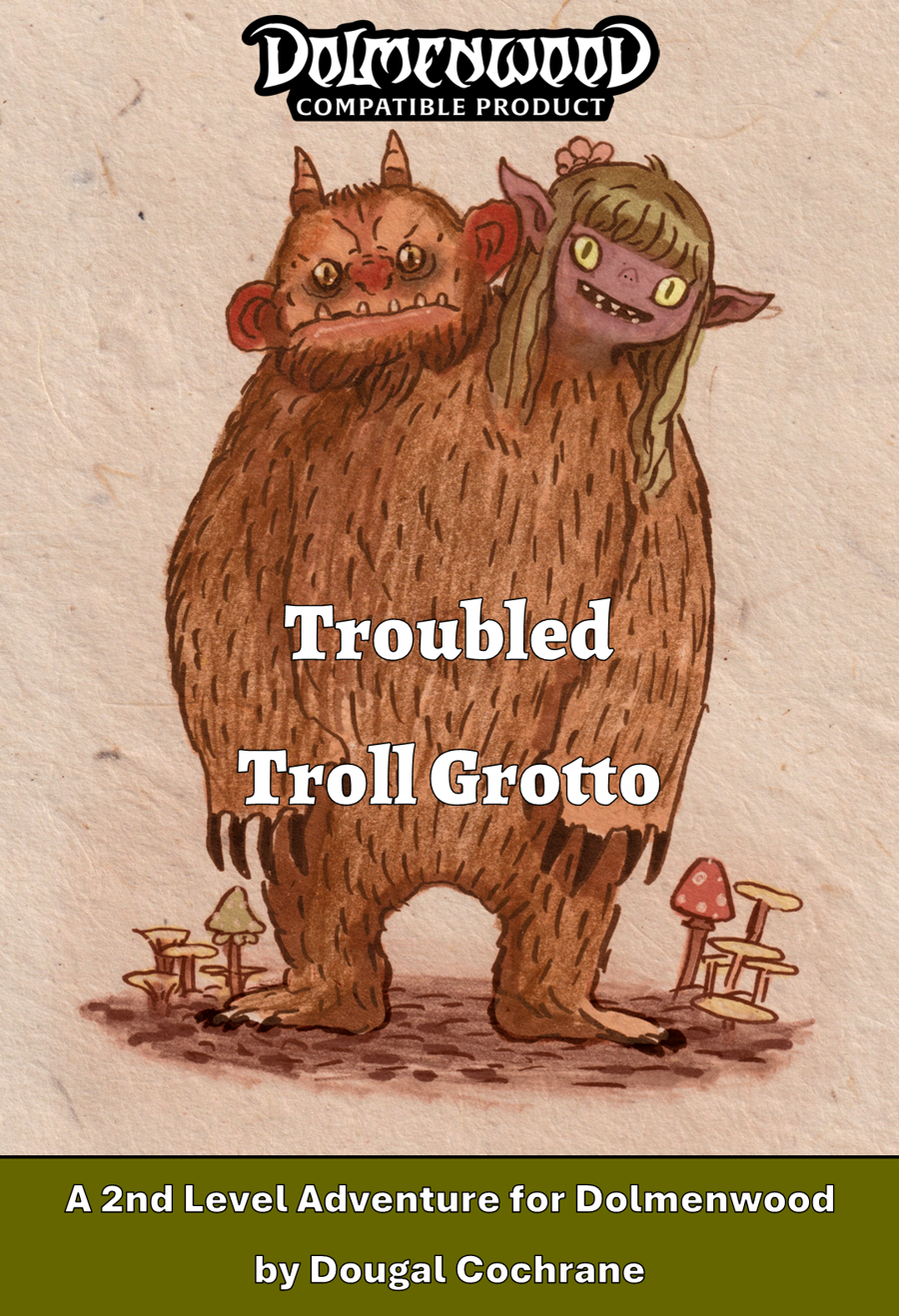
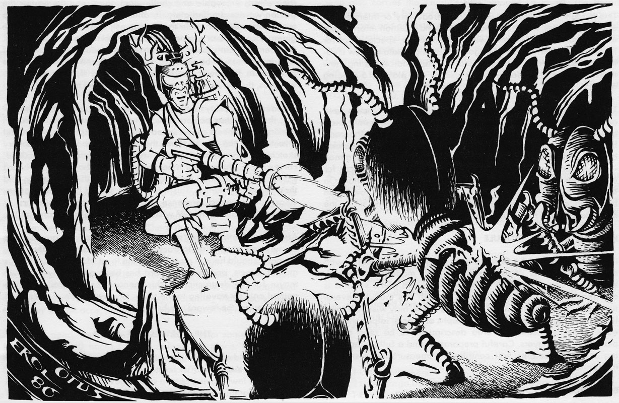
Troubled Troll Grotto
By Dougal Cochrane
Self Published
Dolmenwood
Level 2
Self Published
Dolmenwood
Level 2
South of Fog Lake, where the Cave Path plunges into the Ballow-Clefts, the horizon narrows to a ravine of glistening wet stone, steeped in shadow. Pale yellow celandine flowers bloom ankle-high in the gloom, their petals never fully opening except at noon when the sun shines in. Narrow clefts riddle the rock, most shallow and choked with roots. From one fissure seeps the earthy scent of moss and the sickly odour of mildew. The cavern leads down into the Grotto of Grundlow Greenteeth.
This 22 page adventure uses about nine pages to describe twelve rooms in an underground troll den/garden. It’s wordy, cutsy, and has both too much going on and not enough at the same time.
Can you be nicely formatted and STILL have wall of text issues? Why, yes, I think, now, that you can, after reading this. Is it wall of text, actually? I’m not so sure. It is certain A LOT of text. Because A LOT is going on. And the text, while not in traditional straight paragraph wall of text format, does repeat certain patterns that obfuscates.
But first, our setup. There’s a two-headed troll in a cave, with a grumpy head and a romantic head. He eats moss. He’s got a mossling cook enslaved. Mossling hates grumpy head and is in love with romantic head. Mossling grows herbs and puts grumpy head to sleep. Thus the Bog Red Button. Don’t wake the grumpy troll head … that you generally don’t know exists. Then, there’s a dude with a body switching thing. He’s trying to dig up a gate in the troll cave. He’s made several people switch bodies and minds. And a gang of skeleton thieves (as in, they are skeletons who are thieves.) is trying to knock off a prospector for his emeralds … and the prospector and his donkey have both been mind-switched. And, there’s a slumbering demon who does NOT give eternal youth when awakened. All that shit, and more, is in twelve rooms.
There’s A LOT going on in here. Rooms can range from a column to a page. And this is where things start to get rough. Rooms start with a little description in an offset box that is easy to locate. Let’s say, something like this: “Dark, earthen tunnel (wet stone floor) tangled with thick tree roots (beaded with dripping water). Several wooden buckets (half-filled) sit beneath the largest roots, placed to catch water. A skull is wedged in a crevice halfway along the tunnel.” So, king od a mashup from OSE style to paragraph style. I’m not sure it works. If this had been a paragraph, without parens, or terse OSE, I think it would have gone better. The sentences with lots of parens distracts. I mean, not a bad description by any means, I’m nitpicking here. Certainly better and more evocative than the vast majority of adventures.
And then we move on to the details of the contents of the rooms. And this is, I think, where things start to get rough in terms or formatting. There is a bolded heading and bullets with more details on what to see and do. Maybe a couple of words of description or explanation or mechanics or whatever. And they are nested, so, looking at one thing that has more subparts SHOULD be fine.
I think the issue here is sheer quantity and the use of the bold/bullet/indent format on, essentially, everything. Let us assume I have a bookshelf with 24 books on it. Each book gets a bolded heading/bullet, a sentence or two, and then I move on to the next. A few get a few indents and a mechanic or two. Everything is relatively mundane. Book eleven kills you when you open it. Meh, bad example. You REALLY need to know book eleven is there and it is the only book that does something meaningful, most of the rest is trivia, or else meaningless more or less to the adventure. Should book eleven be in the exact same format as everything else? Should it be highlighted? I’m not sure of my example, here, but I know the principle involved: when everything is special nothing is. I’m looking at a page of, I don’t know, a couple of major headings with read-aloud, major bolded headings, several subheadings, bolding at the start of major sections and in the paragraph text. It’s too much. EVERYTHING is calling for attention. You know how garbage adventures tell you what ‘AC” means and what “read-aloud” looks like? This may be the first adventure in which I think I actually have failed to understand the formatting involved. Everything is calling for your attention. What should I pay attention to? I’m not willing to say this format doesn’t work for complicated rooms, but I am willing to say that it doesn’t work HERE, on THESE rooms.
I don’t know what to say about interactivity. Don’t wakey wakey the grumpy troll head. Feed people sleeping herbs. Maybe do a deal with the skeleton dudes or the wizzo doing the body/mind swaps. I think it’s hard to dig through here and figure out what’s going on. I’m thinking of a room with a kind of west garbage pit in it. I’m thinking like the Trash Compactor scene from Star Wars. There’s a description. There’s a columns of bullets and bolding and sentences. And then there’s this note that a major NPC (mind swapped in to a donkey) is “braying piteously and thrashing to stay afloat in the muck.” Well fuck me man. That’s obviously the reason the room exists. Don’t you think maybe I should know about it sooner, and the party should as well? Why go through all this trouble of description and mechanics of staying afloat and then bury the lead? Most rooms are like this; something important is in there and it’s almost certainly NOT getting called to your attention in any meaningful way.
There’s a lot going on here in a short amount of space over a short amount of time. And, yet, it’s not written to run as a kind of madcap adventure, as that would imply. There’s not enough room for everything going on and there’s both too much going on in the room descriptions while, at heart, not an extreme level of interactivity. It LOOKS like there is, due to all the herbal concoctions and hooks and ind swaps and so on. But I don’t think any of it really means much at all. I’m not going to commit fully to that opinion, this thing is a bear to dig through and that may be impacting my judgement. But, also, I’m pretty sure I’m right. Just fucking walk around and stab everybody and everything is solved and you’re much safer in the end.
This is $5 at DriveThru. There is no preview. Boo! Hiis! We need a preview to make an informed purchasing decision.
https://www.drivethrurpg.com/en/product/563700/troubled-troll-grotto?1892600
Categories: Tabletop Gaming Blogs
Wednesday Comics: DC, August 1985 (week 2)
My mission: to read DC Comics' output from January 1980 (cover date) to the end of Crisis. This week, I'm looking at the comics that were on stands in the week of May 9, 1985.
Warlord Annual #4: This was the first Warlord Annual I bought off the stands, because it has a map of Skartaris in it, which will appear again in Who's Who. I reviewed this issue here.
Atari Force #20: Baron and Bareto/Villagran give the Martin Champion and by extension the rest of the Atari Force their day in court on New Earth. Thanks to Morphea and Targg the court gets a good look at the malevolence of the Destroyer through his psychic residue. Though they are exonerated, there are still powerful forces in New Earth society arrayed against them, so Champion and friends choose to use a device to jump to a new universe to see what else is out there. There's also another humorous Hukka story by Fleming/Giffen/Kesel.
Helfer tells us in the editorial that Atari Force isn't getting canceled because of sales (it's a middling seller) but because it was decided this was the right ending for the characters. I have to say, I'm a little skeptical. I buy it's middle of the pack on sales, but it is a licensed book. Surely a middling wholly DC owned book would be better for the company than having a publishing slot taken up by a licensed book? I do think, though, that the creative teams they've put on the book couldn't figure out anything more to do with the characters. Conway's later issues and Baron's entire run have mostly relied on them being on the ship but not encountering much interesting. No "strange new worlds and civilizations" here. The only mystery is why they didn't have anyone would better ideas, particularly when they were giving the book great artists?
Crisis on Infinite Earths #5: Wolfman and Perez/Ordway open with the Antimatter a bit confused. He thought he destroyed Earth-One and Two, but he hasn't gotten the victory he should have gotten. He lets Psycho-Pirate play the Flash while he investigates. Earth-One and Two have sort of merged and different eras in time are bleeding over. Harbinger and Alexander Luthor assemble a group of heroes to explain what is happening: the Monitor gave his life to power a transfer of the Earths to a netherverse to hide them from his Adversary, but now they now are trying to occupy the same space which will destroy them anyway. The only choice is to re-integrate them as a single universe as it was in the beginning.
We get a lot of cameos, and Travis Morgan, the Warlord, even gets some dialogue.
The Adversary adapts to these developments, though. He takes control of Red Tornado (In a limited series on sale now! Or then, I mean.) and transforms the android for his own purposes. Flash briefly breaks free of the Psycho-Pirate, and we get a glimpse of the shadowy Adversary's face, and he names himself as the Monitor, though he doesn't look like the Monitor we have seen.
Fury of Firestorm #38: Conway and Kayanan/Akin/Garvey have Stein arriving at Vandermeer University in Pittsburgh to start a new position only to find the campus afraid and under siege due to mysterious and vicious killings of facility members. Stein is in danger of becoming the next victim as he is attacked by the Weasel in his apartment. The Weasel keeps ranting about once he kills Stein, he'll be out of danger. Ronnie is out for a date with Doreen where Cliff accuses him of cheating, thanks to his uncharacteristically good grade on a test, when he is summoned to form Firestorm.
Thanks to poor vision and bumbling, both Stein and Raymond are captured by the Weasel and put in a deathtrap with molten steel about to pour on them.
Jonni Thunder #4: Thomases and Giordano bring this detective story/superhero hybrid to a conclusion. First, Jonni has a confrontation with "Slim" Chance which she only wins by wielding the power of the Thunderbolt without the idol. Then after some uncertainty and romantic tension with Harrison Trump, the rival PI, they are ambushed by Red Nails and her crew. Luckily, Jonni has now figured out that the power is in her, not the statue, which gives her the element of surprising, keeping them alive along enough for Detective Sanchez to swoop in with the police. The series ends with a hope for more Jonni Thunder adventures. We'll see how that goes.
Justice League of America #241: The Tuska/Machlan combination on art doesn't do this issue any favors, but mostly it's tough to get back into the New League after the disruptions. A conversation with Vixen prompts Aquaman to head out without telling anyone to find his estranged wife, Mera. Vibe agrees to let Steel date his daughter then gets a new less garish (slightly) costume. Then the team under J'onzz's leadership heads off to Canada where Amazo is on a rampage. J'onzz splits the party, and he and Dale are almost immediately attacked by the android.
Tales of the Teen Titans #56: Wolfman and Patton/DeCarlo bring Raven and the Fearsome Five (minus 1!) into the story. Agents of Gizmo assault STAR Labs to steal Neutron who has been brought in in a containment capsule. Raven shows up and deals with them ruthlessly, but when she realizes what she's doing, she instead uses her power to heal the patients there. Meanwhile, Gar greets Jericho and his mom at the airport to bury the hatchet, and Cyborg undergoes surgery to replace his obviously mechanical limbs with more natural looking ones. The rest of the Titans deal with an attack by the Fearsome, uh, Four, and are defeated in two engagements. The Fearsome Folks make off with a another encapsulated super-being from Tri-State Prison.
Vigilante #20: Wolfman/Kupperberg and Smith/Maygar reveal that giving up the Vigilante identity may not prove so easy for Chase. The Vigilante is still in the streets, more violent than ever, including killing a cop. Meanwhile, Chase seems like he's having a nervous breakdown as he is tormented by nightmares where he is the Vigilante committing these acts. He wonders if he might somehow have lost his mind and actually be responsible. Nightwing fights with the murderous Vigilante in the streets, but winds up getting thrown off a bridge. Later, he crawls in through Chase's window to confront him.
Categories: Comic Book Blogs, Tabletop Gaming Blogs
Speed Racer Vol. 1
Mad Cave’s Speed Racer – Vol. 1 wastes no time proving it isn’t just a modern repaint of a classic property. David Pepose and Davide Tinto take the familiar iconography…
The post Speed Racer Vol. 1 appeared first on First Comics News.
Categories: Comic Book Blogs
David Pepose on Speed Racer
Recently, I sat down with David Pepose to talk about Mad Cave Studios’ Speed Racer, whose 8th issue is released today. Also, the first Speed Racer trade was recently released,…
The post David Pepose on Speed Racer appeared first on First Comics News.
Categories: Comic Book Blogs
RICH REVIEWS: Grips Remastered # 1
Title: Grips Remastered # 1 Publisher: Razorverse Created/Written by: Kris Silver Artist: Tim Vigil Colors by: Patricio Hernandez Produced by: Everette Hartsoe Cover: Everette Hartsoe Variant Covers: Pat Hernandez, Frederick…
The post RICH REVIEWS: Grips Remastered # 1 appeared first on First Comics News.
Categories: Comic Book Blogs
It Came From The Radio: Interview Show
In 3 separate Interviews, Jenny Feldy talks w/Author Paul Pape, Filmmaker David Seth Cohen, and Greg Cioffi
The post It Came From The Radio: Interview Show appeared first on First Comics News.
Categories: Comic Book Blogs
FANTASTIC COMIC FAN: David Pepose and Speed Racer
Welcome, Davide Pepose, back to the show to dig into Mad Cave Studios’ Speed Racer— when was the last time you went down into the Cave?
The post FANTASTIC COMIC FAN: David Pepose and Speed Racer appeared first on First Comics News.
Categories: Comic Book Blogs
RICH REVIEWS: Female Force: Carol Burnett # 1
Title: Female Force: Carol Burnett # 1 Publisher: Tidal Wave Comics Writer: Michael Frizell Pencils: Ramon Salas Letters: Benjamin Glibert Colors: Ramon Salas Cover: Pablo Martinena Price: $ 8.99 US…
The post RICH REVIEWS: Female Force: Carol Burnett # 1 appeared first on First Comics News.
Categories: Comic Book Blogs
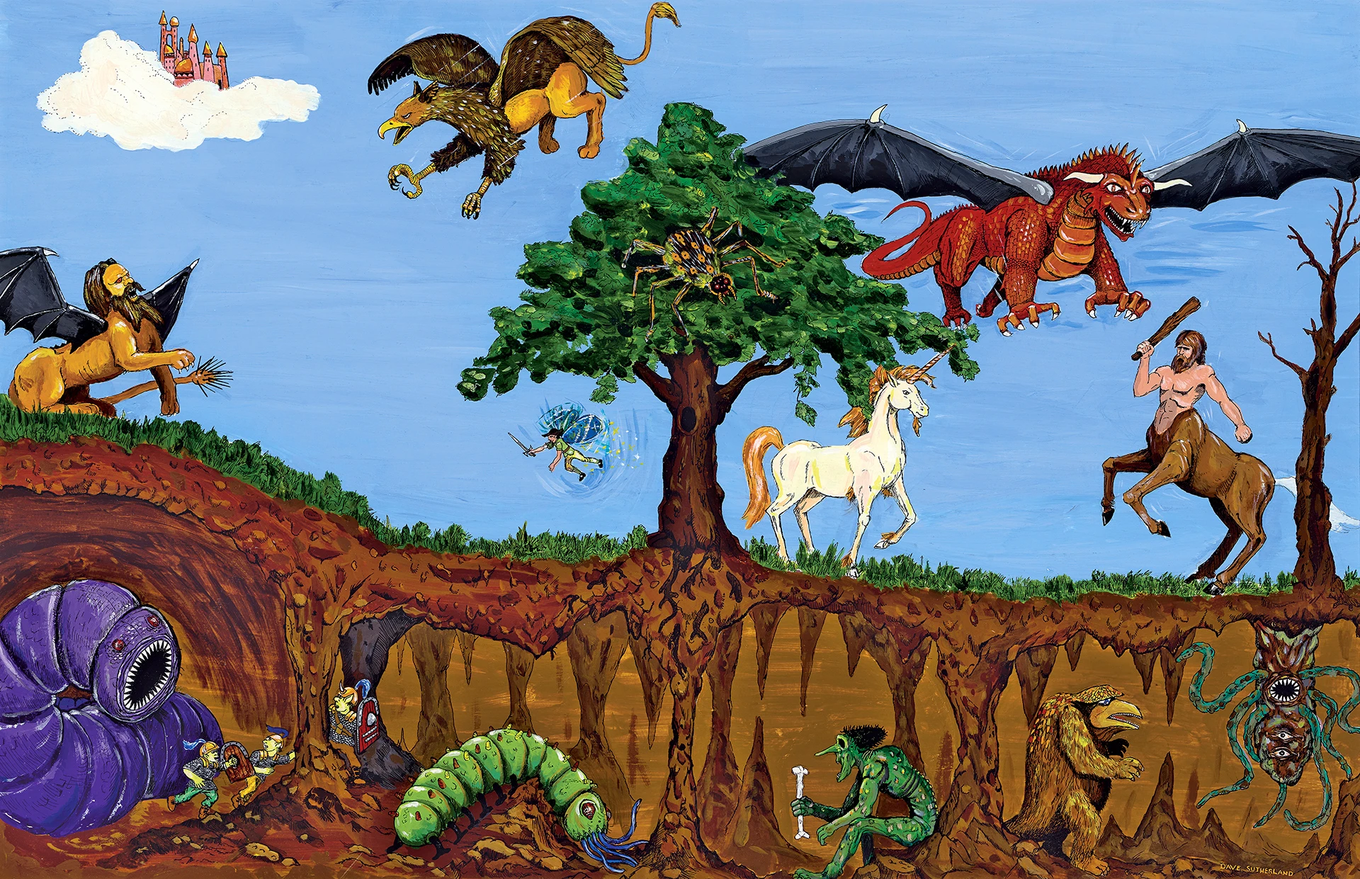
40 Years a Gamer: The Artists Who Inspired Me – Early Artistic Luminaries of TSR
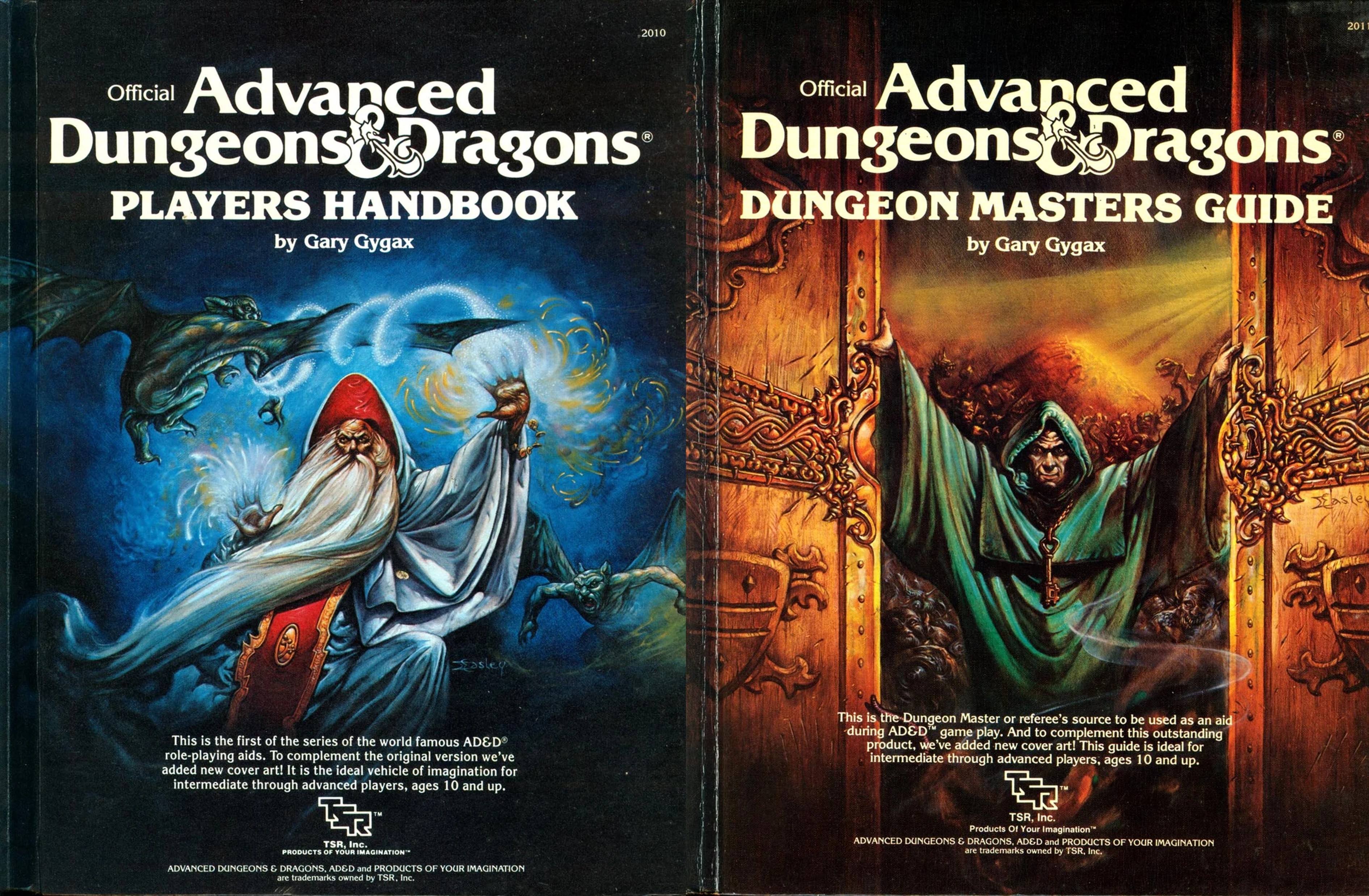
I began playing D&D during the heyday of the artists known as the “Four Horsemen” of TSR—Elmore, Easley, Caldwell, and Parkinson—which I discussed in my previous post on the artists who inspired my TTRPG gaming.
However, I switched from BECMI D&D over to AD&D around the winter of 1987, if memory serves. I remember it vividly because during one of those very first sessions, I was running the game as the Dungeon Master while listening to the American Top 40 end-of-year countdown. But I had actually been buying and reading the AD&D 1st Edition books for a few months before we ever rolled dice.
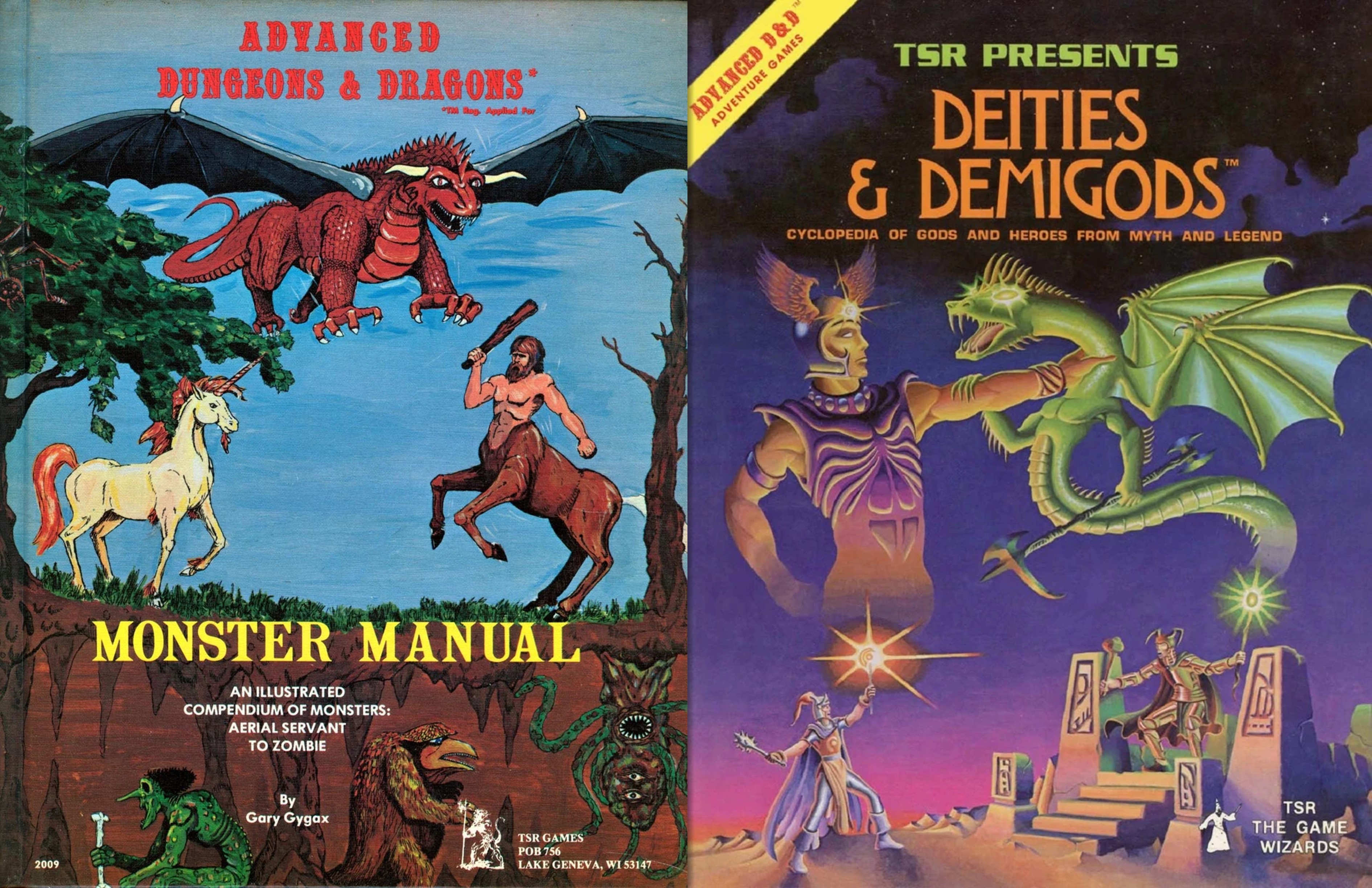
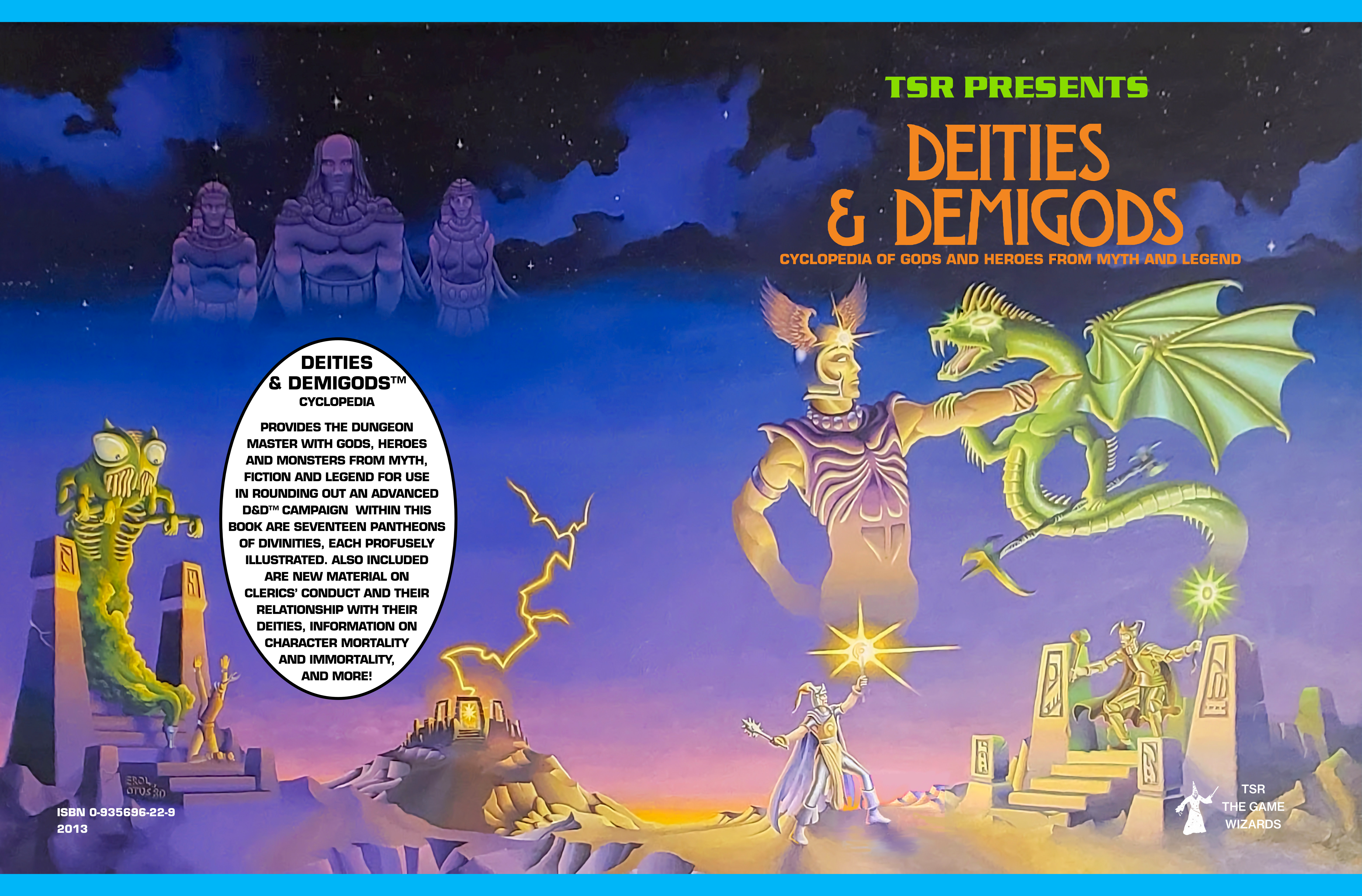
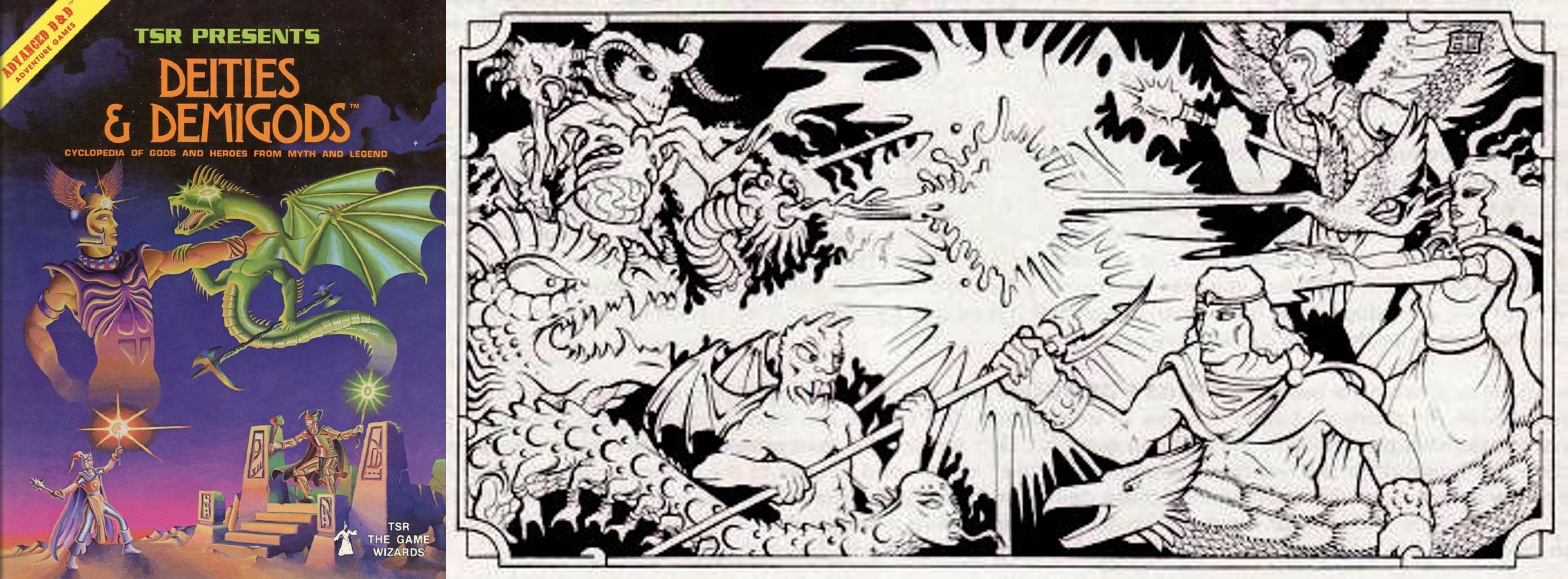
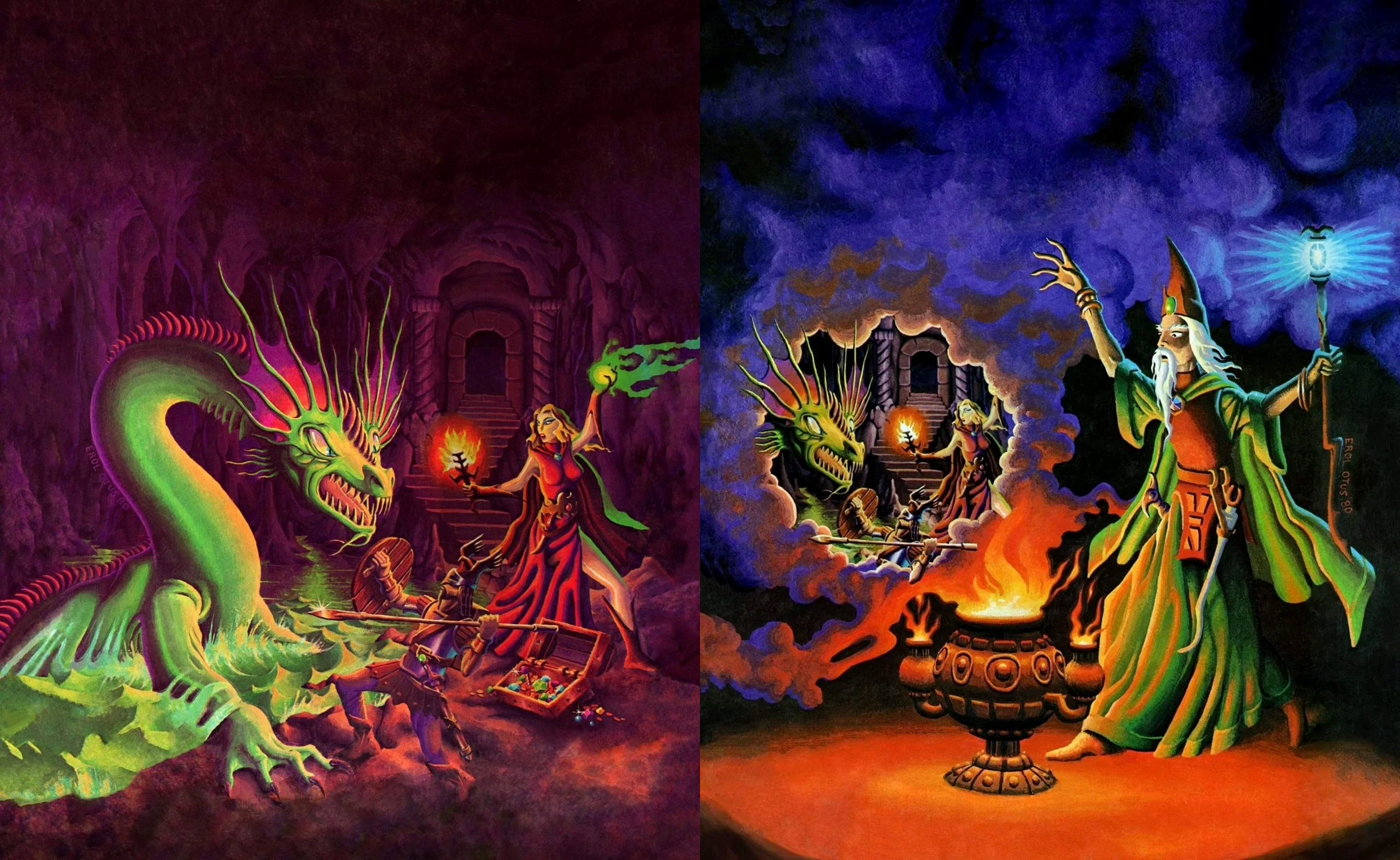
My original AD&D 1e books were the orange-spine printings featuring the iconic covers by Jeff Easley. I got the Dungeon Masters Guide (DMG) first, followed by the Players Handbook (PHB). The only two AD&D books I owned that were not orange-spine editions were the original Monster Manual (MM) and a copy of Deities & Demigods (the rare printing that still included the Cthulhu and Melnibonéan Mythos!), which I scored from a neighbor’s garage sale. You can read the full story about that lucky find right here.
The covers for Deities & Demigods by Erol Otus and the Monster Manual by David A. Trampier served as my true introduction to TSR’s earlier art style. But, despite my books sporting the newer Easley covers on the outside, the interiors still featured the original 1e layout and illustrations. And I must admit… at first, I was turned off by them.
Let me explain before you burn me at the stake!
I came into the hobby through the Mentzer Red Box and the rest of the BECMI sets. While they weren’t anywhere near as cleanly laid out as modern games, they had a very approachable, easy-to-use style. They were specifically designed to welcome you in and teach you the game.
When you dive into the 1e PHB—and especially the DMG—they are not easily approachable books. I know now that their design came directly from the layout style of miniature wargaming rulebooks, but to young me, they just felt like inscrutable, textbook-like mystery tomes.
To add to my confusion, I started reading the books in the opposite order to their publication! Starting with the DMG didn’t make much sense if you hadn’t read the PHB first. I eventually figured it out and switched books, but coming directly from the polished look of BECMI, I was a little disappointed by the interior art.
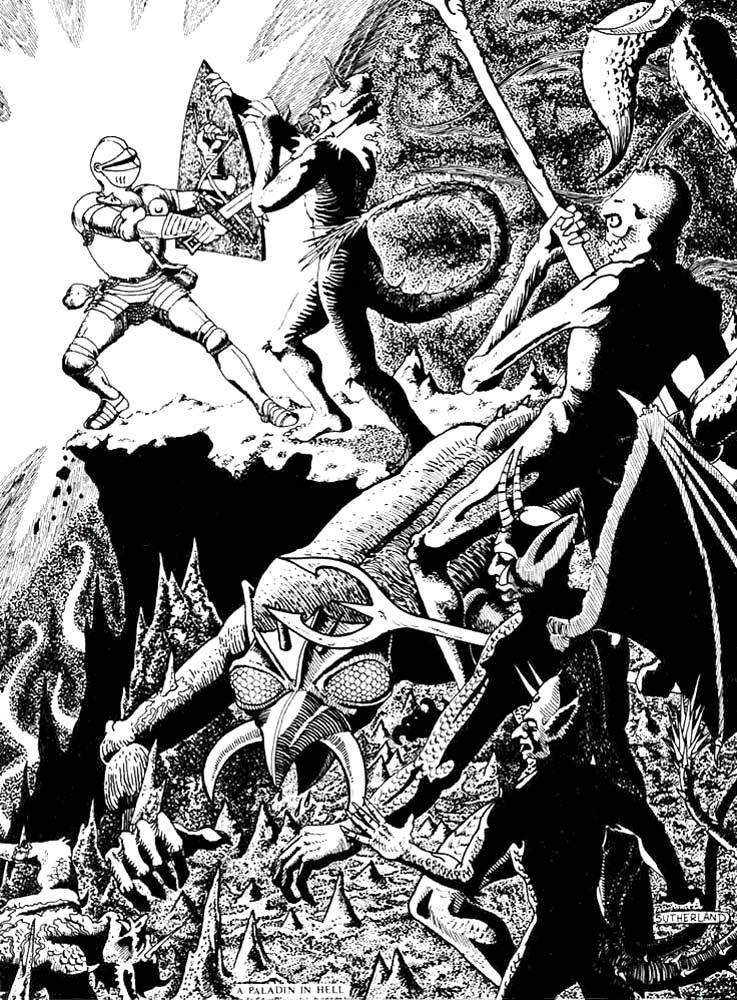
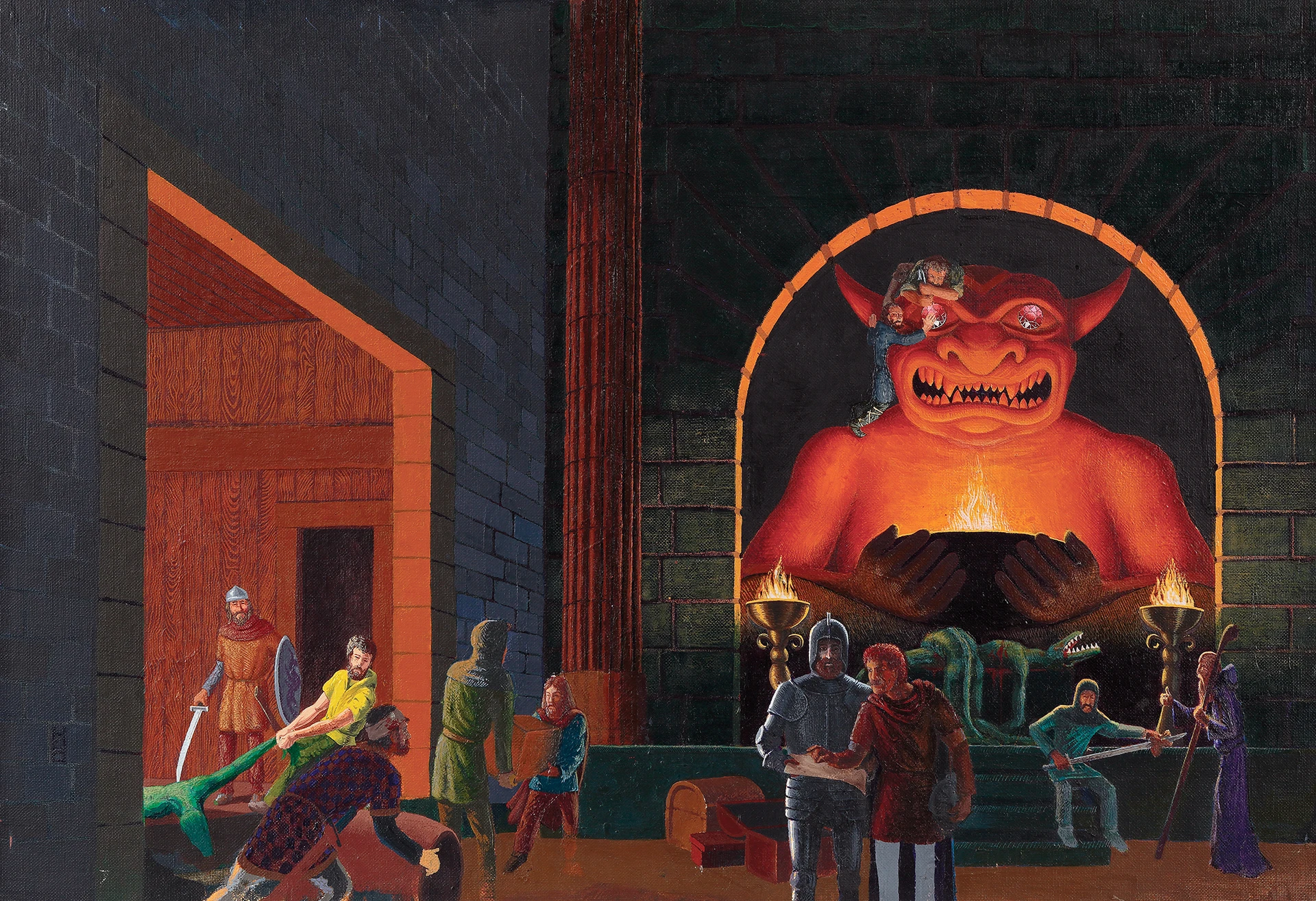
The cartoonish illustrations next to the Intelligence and Dexterity tables in the PHB were okay, but they didn’t quite match my epic expectations for the game. I’ve also never been a huge fan of the “races” lineup on page 18 by David Sutherland. But then I flipped a few pages and saw his A Paladin in Hell full-page piece… and I was absolutely blown away!
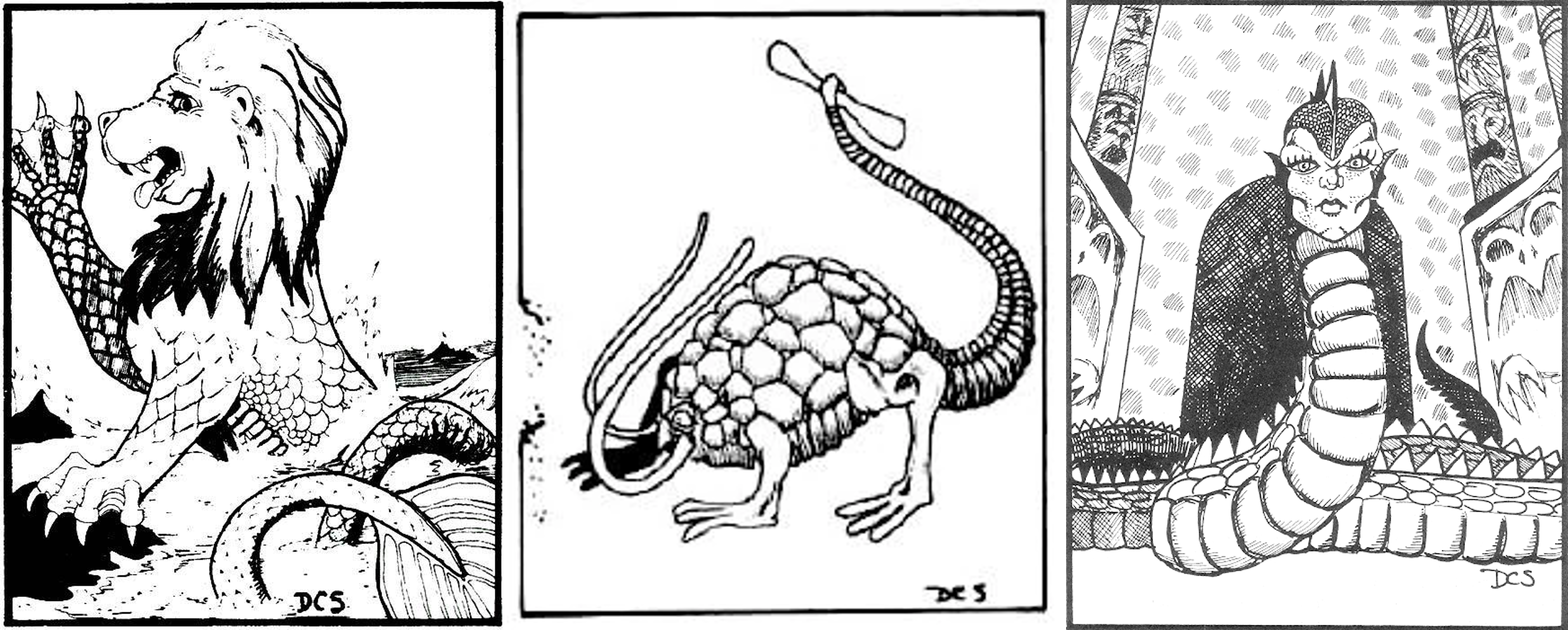
The MM had more illustrations that captured my imagination. But it was truly through the original Deities & Demigods that I learned to appreciate the old-school, foundational art of early TSR deeply. So, let me talk about these luminaries—Jeff Dee, Erol Otus, David C. Sutherland, David A. Trampier, and Jim Roslof—the artists who were there at the birth of the hobby, and how their work inspired me!
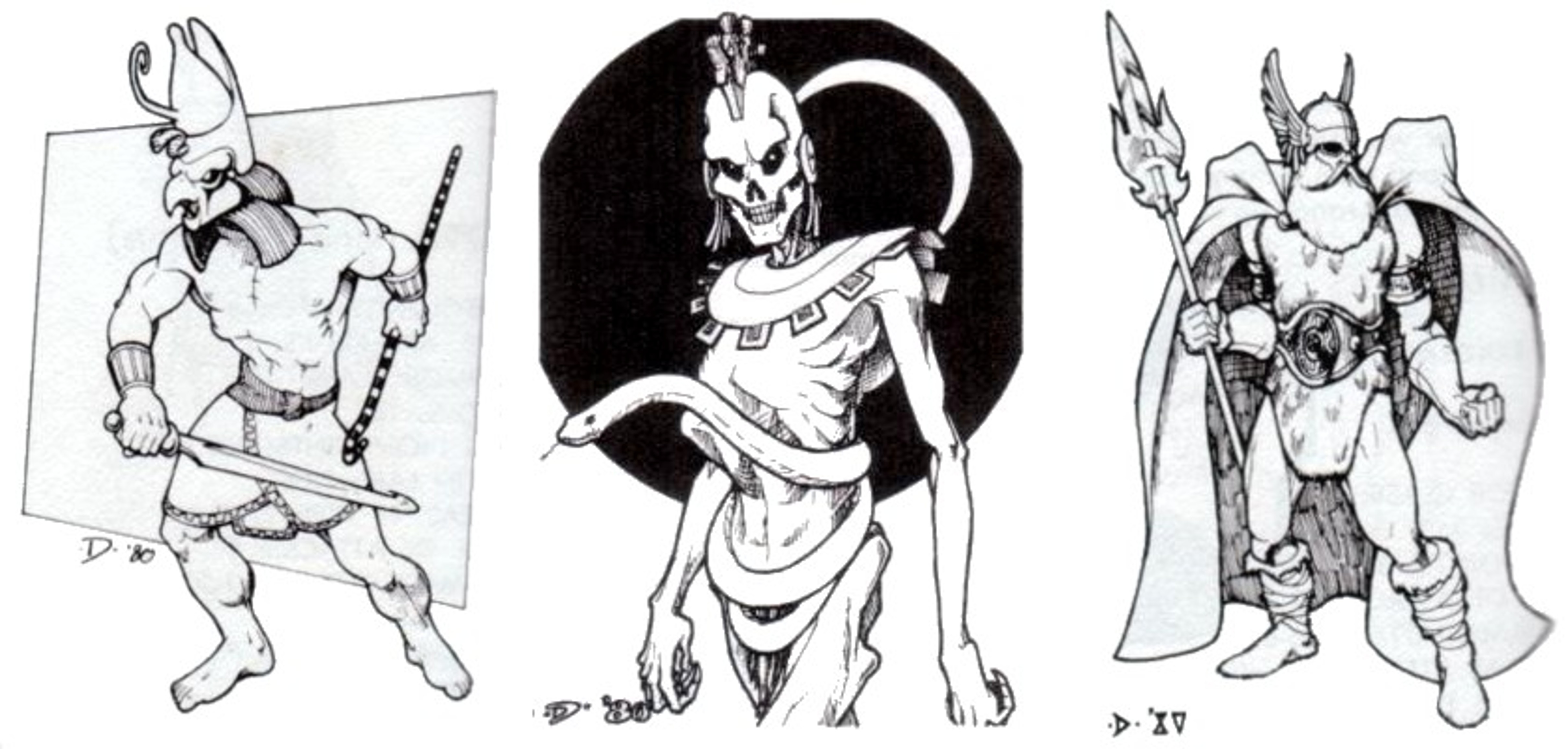
Jeff Dee
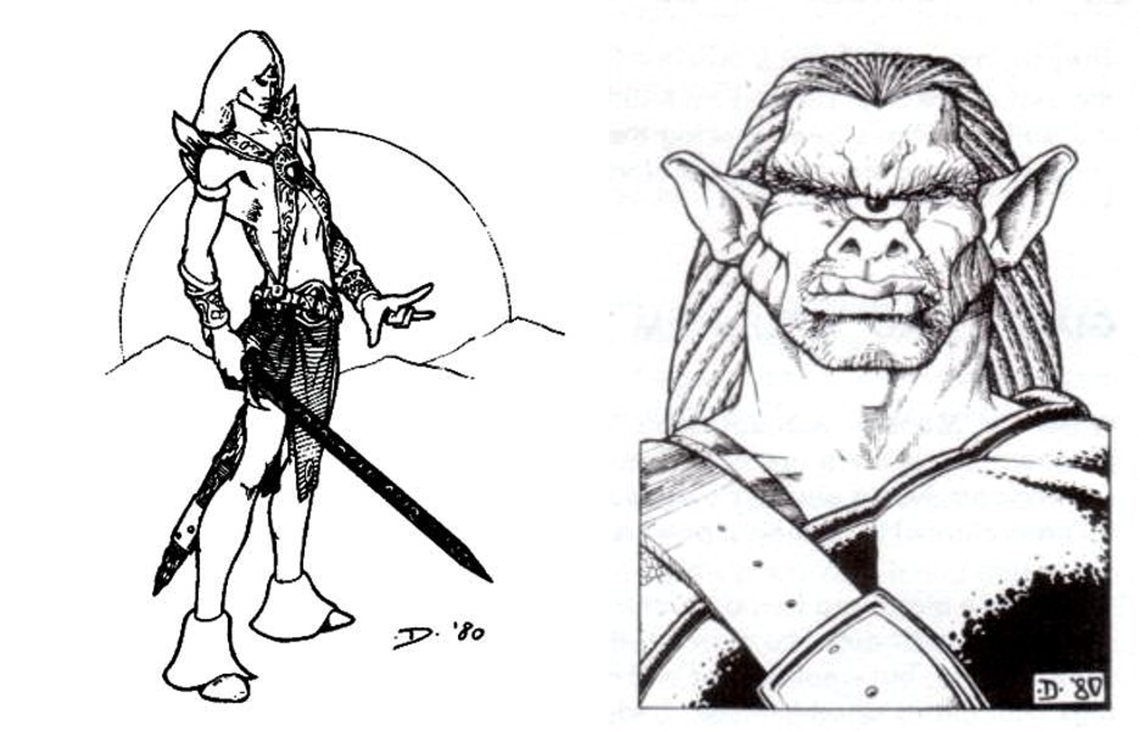
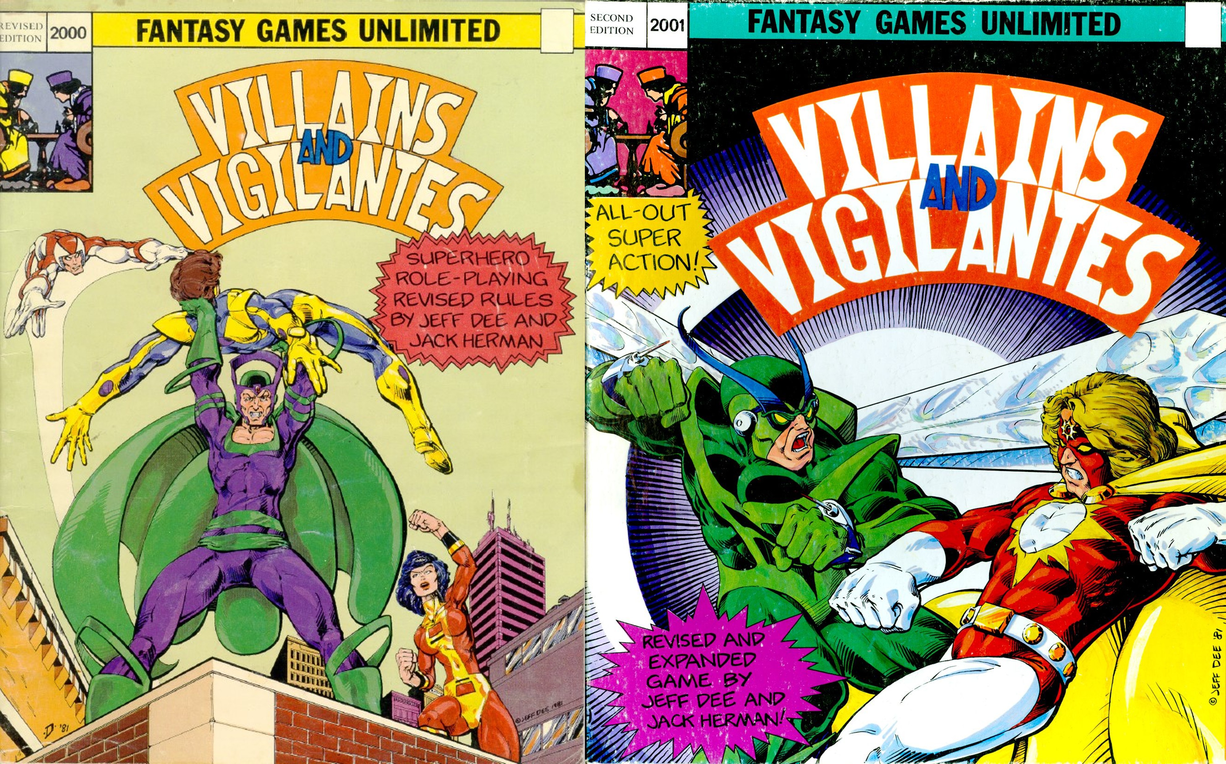
Of all the artists who originally worked for TSR, Jeff Dee is my absolute favorite. He has a distinct, clean style with clear comic-book influences. He didn’t just work on D&D; he also illustrated Villains & Vigilantes and The Mighty Protectors. I was actually lucky enough to interview him here on the blog back in 2015.
I must admit that of all the original TSR artists, his was the only name I knew by heart for a long time. As my interest in the hobby grew, I learned about the other legends and their trajectories, but Dee’s name always stuck with me. Strangely enough, I had no idea what he actually looked like. So, when I started watching episodes of The Atheist Experience and heard his name, I thought, “Huh, this guy has the same name as the fantasy artist.” Little did I know they were the same person!
His work on the Norse, Egyptian, Melnibonéan, and Non-Human Mythos sections of Deities and Demigods blew me away. That book was my first introduction to Elric of Melniboné, and Dee’s illustration of Gruumsh is still exactly how I imagine the orc god today. Jeff worked on a lot of classic modules that I read but never actually played, and because of his distinctive line work, even as a teenager, I could immediately tell when he had drawn something.
Later on, I discovered his art for Villains & Vigilantes, which completely solidified my love for his work. His aesthetic reinforced for me the connection between comic books and the fantasy genre, which I still think is a perfect fit.
Jeff Dee didn’t draw any of the monsters in the original MM. But he did draw my absolute favorite monster in the Fiend Folio—which also happens to be my favorite non-traditional D&D ancestry, the Aarakocra! Their physiology in the game may have changed over the years (they now have separate arms and wings), but to me, Dee’s illustration is the true Aarakocra.
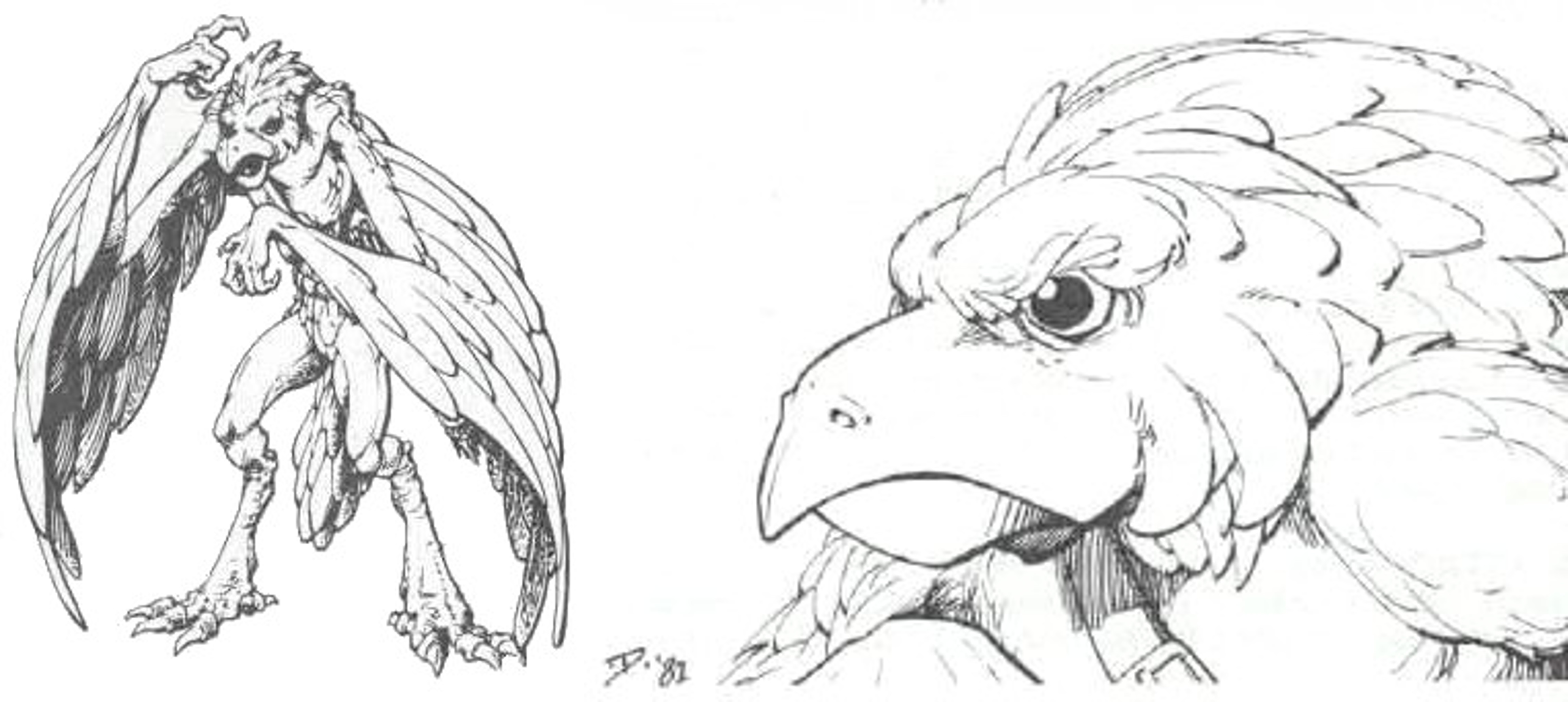
Erol Otus
Otus is my second favorite artist from this period. Just like Jeff Dee introduced me to Elric, Otus introduced me to Cthulhu via Deities & Demigods. While I wouldn’t discover H.P. Lovecraft’s actual writings or the Call of Cthulhu RPG until a year later, this book was my very first exposure to the Mythos.
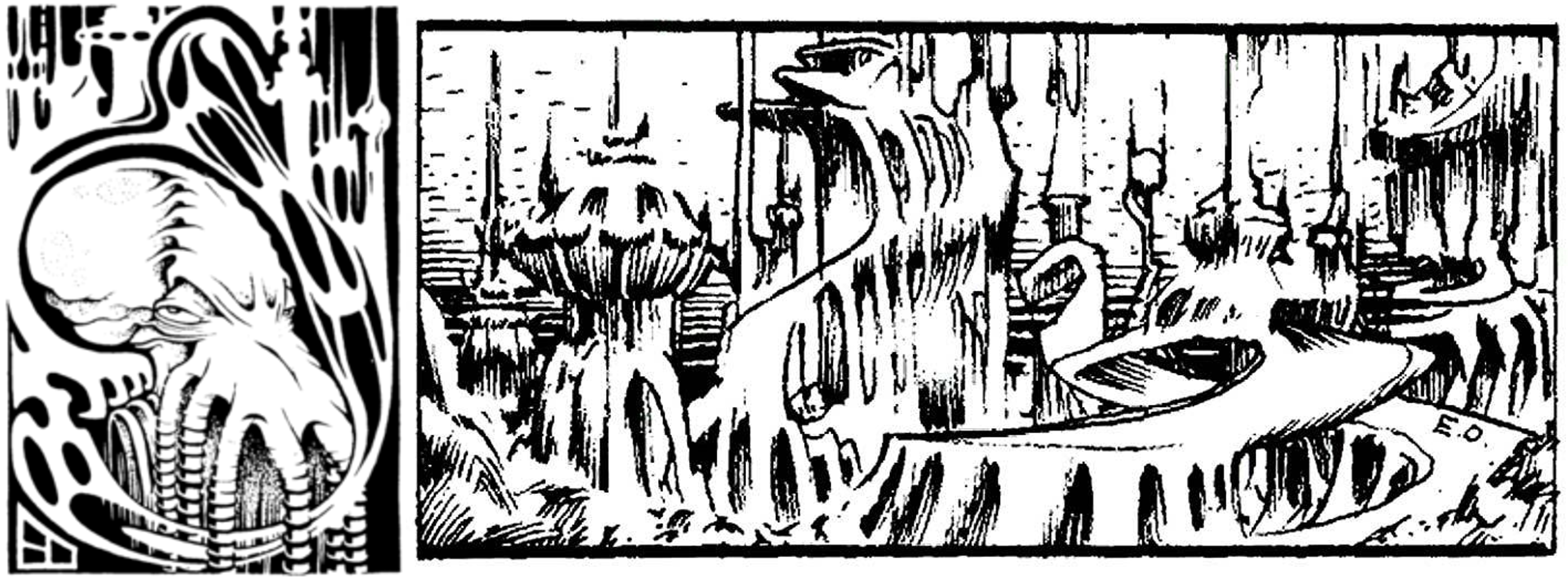
Erol Otus’ cover for that book absolutely beckoned me. While Sutherland’s MM cover was great for showing you the creatures inside, Otus’ Deities & Demigods cover illustrated the terrifying, cosmic connection between mortals and deities perfectly and efficiently.
I would only discover and come to appreciate his iconic covers for the Basic and Expert sets much later in the late 90s, when I finally tracked down used copies. Perhaps because I discovered it so much later, his dragon on the Basic set isn’t my definitive mental image of a dragon—Elmore had already imprinted that concept onto me with his Red Box art.
But when I began collecting old Gamma World supplements and adventures, I was thrilled to find his work scattered throughout that line as well.
Erol Otus’ modern work is reminiscent of a psychedelic dream, and I mean that as the highest possible praise. His style is a perfect fit for the weird, gonzo feel of Goodman Games’ Dungeon Crawl Classics (DCC). He even drew one of my favorite interpretations of my favorite D&D Cthulhian monster—the Aboleth—for the cover of DCC Module #25: The Dread Crypt of Srihoz.
David C. Sutherland III
Sutherland wasn’t my favorite artist of the bunch, but his A Paladin in Hell is arguably a masterpiece of early RPG art. When I rolled up my very first character—a Paladin—that illustration was exactly how I imagined him!
His cover for the DMG is an undeniable classic. It’s incredibly evocative, and much like the MM cover, I can deeply appreciate the nostalgia it elicits and how it influenced later generations of gamers, even if it isn’t my personal favorite piece.
What I do love is his monster illustrations inside the Monster Manual. Some of them were quite simple, but they captured my imagination completely. I prefer his smaller, in-text illustrations to his full-page spreads. His Mind Flayer is so basic, yet incredibly charming. I love his Sea Lion and Rust Monster, but his Naga remains my absolute favorite in the book.
Fun fact: While researching this post, I discovered that Sutherland designed my favorite creature from the Monster Manual II—the Wemic—which was first published in Monster Cards Set 3 with art by Jim Roslof!
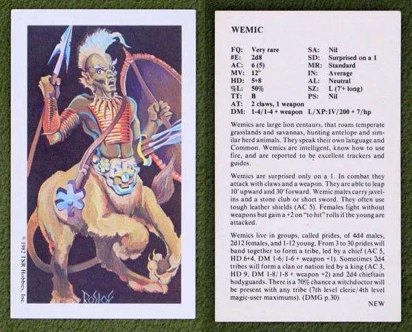
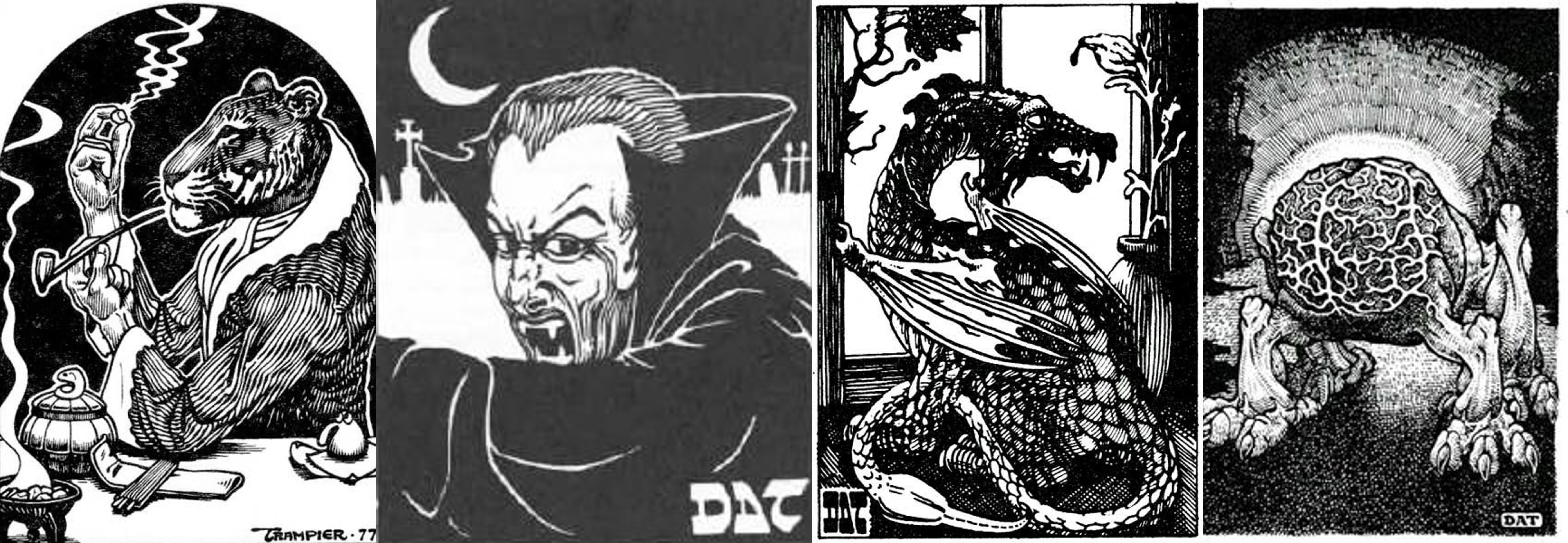
David A. Trampier (DAT)
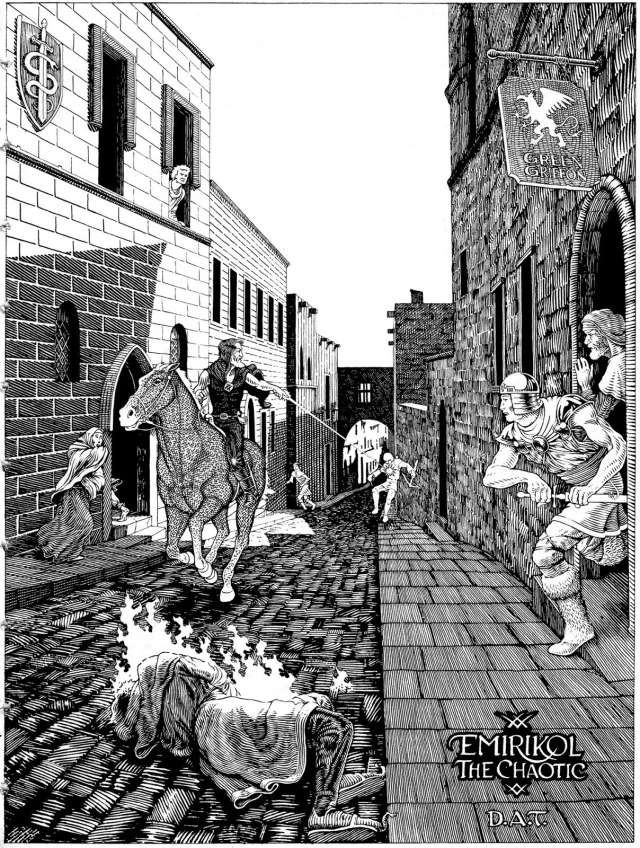
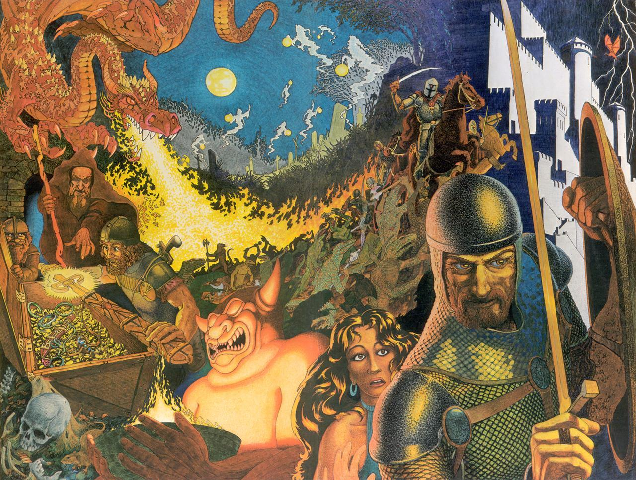
I was never really into Trampier’s Wormy comic strip; it just didn’t catch my fancy. I primarily knew his art from the AD&D 1e rulebooks. His illustration of Emirikol the Chaotic riding through the streets in the DMG is my favorite piece in that entire book. The sheer action and excitement of it invited you to imagine the story happening around the frame. I desperately wanted to play in a game that felt like that!
In the Monster Manual, his illustrations for the Rakshasa, Vampire, Pseudodragon, and Intellect Devourer immediately made me want to throw those monsters at my players.
I finally got a second-hand copy of the PHB featuring his original cover around 1993, and of the three original AD&D core books, it is my favorite cover. It is the perfect classic murder-hobo scene; it captures the dark, dangerous feel of an old-school dungeon crawl.
However, my second favorite piece of art by DAT is something I never actually owned: the panoramic art for the original AD&D 1e Dungeon Masters Screen. It is a masterpiece. You might argue it’s technically better than Emirikol, but the DMG art remains near and dear to my heart simply because of how deeply it inspired my games.
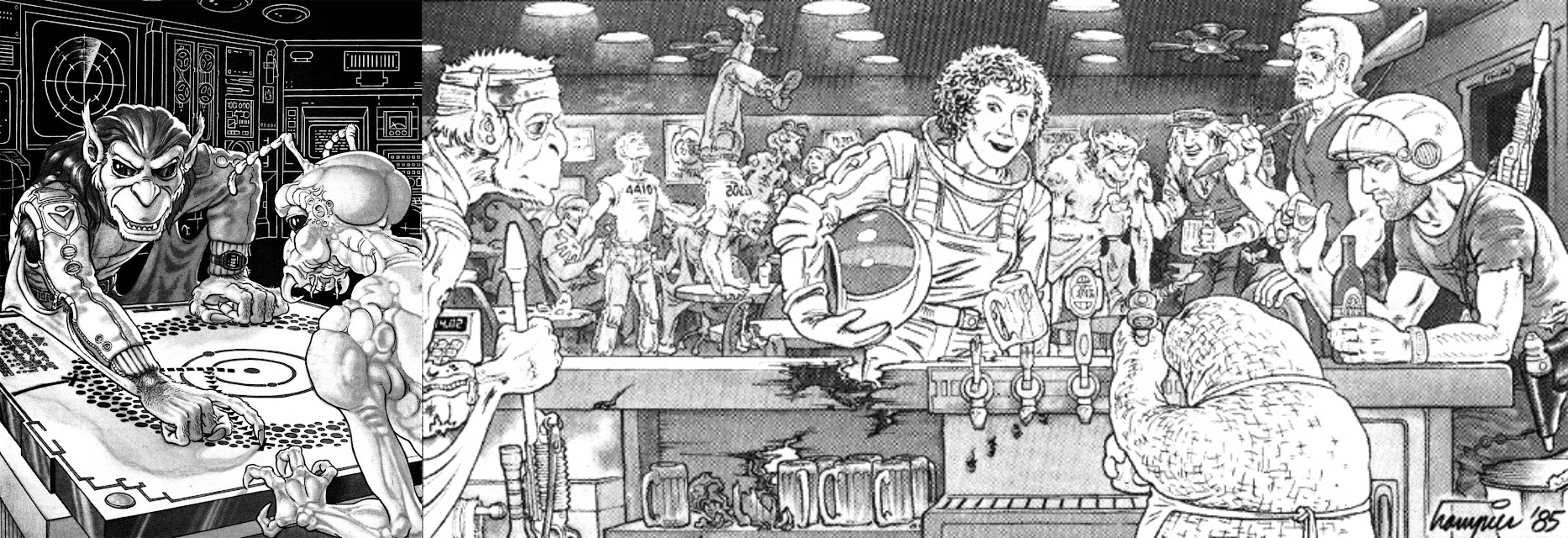
Another fun fact I learned while writing this: DAT also created illustrations for one of my favorite sci-fi games, Star Frontiers!
Jim Roslof
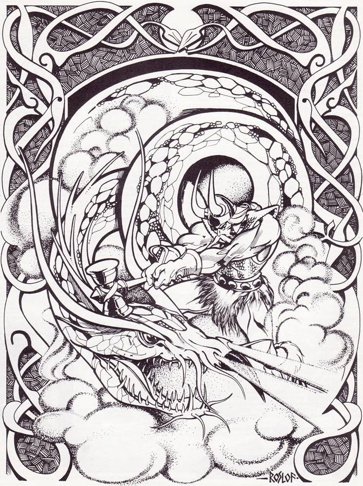
When I originally outlined this post, Roslof wasn’t on my list. But as I flipped through my old books for research, I saw his full-page illustration of Thor. I immediately realized just how important that specific piece of art was to sparking my lifelong interest in Norse mythology. It is a powerful, inspiring image and an absolute classic of D&D art.
It’s also worth noting that, as TSR’s Art Director, Roslof was pivotal in hiring the exact artists I wrote about in my previous post in this series (Elmore, Easley, etc.), so the inspiration really does come full circle!
I am still not done talking about the classic TSR artists! Keep an eye out for the next post in this series as we continue the 40-year retrospective.
Categories: Tabletop Gaming Blogs
The best classic Dungeons & Dragons modules for an Inner Earth campaign For The Castles & Crusades rpg
For a campaign diving deep into the foundations of the world, "classic" D&D offers everything from gritty survival to high-fantasy politics. If you are looking for the definitive adventures that shaped the concept of "Inner Earth," these modules are the essentials. This blog post picks up from OSR Commentary Adapting C1: The Hidden Shrine of Tamoachan To Aethel, the Sunken Core Needleshttp://www.blogger.com/profile/11243274667834930867noreply@blogger.com0
Categories: Tabletop Gaming Blogs
Video of the Day – Doctor Who: The Silence, 2011
The post Video of the Day – Doctor Who: The Silence, 2011 appeared first on Blogtor Who.
Categories: Doctor Who Feeds
Talon and Company Adapted From The Sword & Sorcerer 1982 for Sword of Cepheus 2nd Edition
Bringing the 1982 cult classic The Sword and the Sorcerer to the tabletop requires capturing that specific "heavy metal" fantasy aesthetic. In the Sword of Cepheus (2nd Edition) system, Talon is a high-powered protagonist, likely built with more than the standard three terms of experience.Here is the breakdown for Talon and his Mercenary Warband.TalonCareer: Mercenary (4 Terms)Rank: Needleshttp://www.blogger.com/profile/11243274667834930867noreply@blogger.com0
Categories: Tabletop Gaming Blogs
DYLAN BROCK IS THE KEY TO ENDING THE WAR BETWEEN KNULL AND HELA IN QUEEN IN BLACK #3!
Check out the cover for QUEEN IN BLACK #3 by Al Ewing and Iban Coello along with QUEEN IN BLACK tie-in issues on sale in August, including QUEEN IN BLACK:…
The post DYLAN BROCK IS THE KEY TO ENDING THE WAR BETWEEN KNULL AND HELA IN QUEEN IN BLACK #3! appeared first on First Comics News.
Categories: Comic Book Blogs
Chibi Ladybug and Cat Noir Take Over Paris!
MIRACULOUS CHIBI 3-IN-1 VOL. 2 Coming this Summer from Papercutz Bigger Laughs, Bigger Chaos, and More Chibi Adventures with Ladybug, Cat Noir, and Friends MAY 5, 2026 (PORTLAND, OR) —…
The post Chibi Ladybug and Cat Noir Take Over Paris! appeared first on First Comics News.
Categories: Comic Book Blogs
TOKYOPOP LAUNCHES TOKYOPOP KIDS PUBLISHING IMPRINT
New imprint debuts first titles in Fall 2026 and is dedicated to releasing manga, international graphic novels, illustrated chapter books, and picture books for younger readers Los Angeles, CA…
The post TOKYOPOP LAUNCHES TOKYOPOP KIDS PUBLISHING IMPRINT appeared first on First Comics News.
Categories: Comic Book Blogs
MEET THE CAST OF WORST MAN, A HILARIOUS HEIST-ROMCOM!
Ahead of WORST MAN’s release this August, it is time to meet the cast. Here are some of the unforgettable characters at the heart of this sun-soaked chaos! Set against…
The post MEET THE CAST OF WORST MAN, A HILARIOUS HEIST-ROMCOM! appeared first on First Comics News.
Categories: Comic Book Blogs
Oh Catherine! – Catherine Tate Stars in Oh Mary!
Doctor Who’s Donna Noble, Catherine Tate, stars in dark comedy Oh Mary! until July
Doctor Who’s Catherine Tate is the latest star to take the role of Mary Todd Lincoln in the West End production of Oh Mary! The play is an uproariously dark comedy about a miserable, suffocated Mary Todd Lincoln in the weeks leading up to Abraham Lincoln’s assassination. Unrequited yearning, alcoholism, and suppressed desires abound in this 80-minute one-act play that finally examines the forgotten life and dreams of Mrs. Lincoln. It depicts her as an alcoholic former cabaret star trapped in a largely loveless marriage with the deeply closeted Abraham.
Tate takes over the role from Mason Alexander Park (The Sandman, Quantum Leap.) Across the Atlantic, the Broadway production of Oh Mary! has starred actors such as Jinkx Monsoon (The Devil’s Chord), Jane Krakowski (30 Rock), and currently Maya Rudolph (Saturday Night Live.)
Declared “one of the best comedies in years” by The New York Times, Oh, Mary! received Tony Awards for Best Leading Actor in a Play (Cole Escola) and Best Direction of a Play (Sam Pinkleton).
The former Doctor Who star, who played companion Donna Noble from 2006 to 2010 before returning to the role for the 60th anniversary in 2023, will be appearing in eight performances a week until the 18th of July. You can buy your tickets now from the Trafalgar Theatre website.
Though best known for her television roles, such as Doctor Who, The Office, and her own Catherine Tate Show, Tate has been appearing on stage in dozens of productions since 1988’s Blood Wedding. Notable roles including Lydia in Arthur Miller’s All My Sons, Michelle in Under the Blue Sky, and Peggy in The Enfield Haunting. Perhaps most famously, however, is her astonishingly entertaining double act with Who co-star David Tennant for the 2011 production of Shakespeare’s Much Ado About Nothing.
The post Oh Catherine! – Catherine Tate Stars in Oh Mary! appeared first on Blogtor Who.
Categories: Doctor Who Feeds
Act 4 Publishing & Skybound Share First Look at Jason Pearson’s Body Bags Artist’s Edition
Mack “Clownface” and Panda Make Their Artist’s Edition Debut in 2026 LOS ANGELES 5/5/2026 — Today Skybound and Image Comics, in partnership with Scott Dunbier’s Act 4 Publishing and Keven Gardner’s 12-Gauge Comics, shared a first look at the definitive new…
The post Act 4 Publishing & Skybound Share First Look at Jason Pearson’s Body Bags Artist’s Edition appeared first on First Comics News.
Categories: Comic Book Blogs